Signs, plaques and accessible door signage
Door plates and room identification are where signage meets accessibility. BS 8300 sets mounting heights, contrast values and tactile requirements — and the numbers are specific.
Door plates, room numbers, department signs and commemorative plaques are the least discussed part of a signage scheme and the part users touch most. They are also where accessibility stops being a general principle and becomes a set of numbers.
BS 8300
BS 8300 is the British Standard giving practical guidance on inclusive design in the built environment, including signs, symbols, lighting and positioning. It sits alongside the accessibility duties under the Equality Act 2010 and the Building Regulations.
The recommendations that most directly change how a plate is made:
Mounting height. Wall-mounted directional signs are recommended with their centre between 1,400 mm and 1,700 mm above finished floor level. Tactile and Braille signs are placed at around 1,500 mm, within about ±100 mm, so they can be found and read by touch. Overhead signs want a minimum clear height of about 2,200 mm.
Luminance contrast. Two figures, and they are separate.
- Between the text or pictogram and its own background: a minimum difference of 70 points of Light Reflectance Value.
- Between the signboard and the surface it is mounted on: a minimum of 30 LRV points.
The second one is the forgotten one. A perfectly contrasting sign that disappears into the door it is fixed to has solved half the problem.
Typography. Simple sans-serif typefaces improve readability at distance. Text should not be set entirely in capitals, because the varied outline of mixed-case words is part of how they are recognised at speed.
Tactile form. Key location information — sign directories, orientation signs, room identification — should be available in tactile form as well as visually where it is low enough to be touched. Tactile signs use raised text and symbols, and Braille where appropriate. Raised characters are read with a fingertip, so the letter shape has to be simple and the edges have to be clean.
What that means for engraving
Two things follow directly.
Engraved-and-filled letters are recessed, not raised. A rotary or laser engraved letter filled with a contrasting colour gives excellent visual contrast and a durable finish, and it is not tactile. Where tactile lettering is required, the letters must stand proud of the plate — a different construction.
Contrast should be measured, not eyeballed. LRV is a number that comes with the material, not an impression. “Dark grey on black” can look smart and fail the 70-point test comfortably.
Materials
- Engraving laminate — the default for interior door plates. Colour is structural, standard combinations give predictable contrast, and it takes small text cleanly.
- Anodised aluminium — where the plate is exposed or wants a metal appearance.
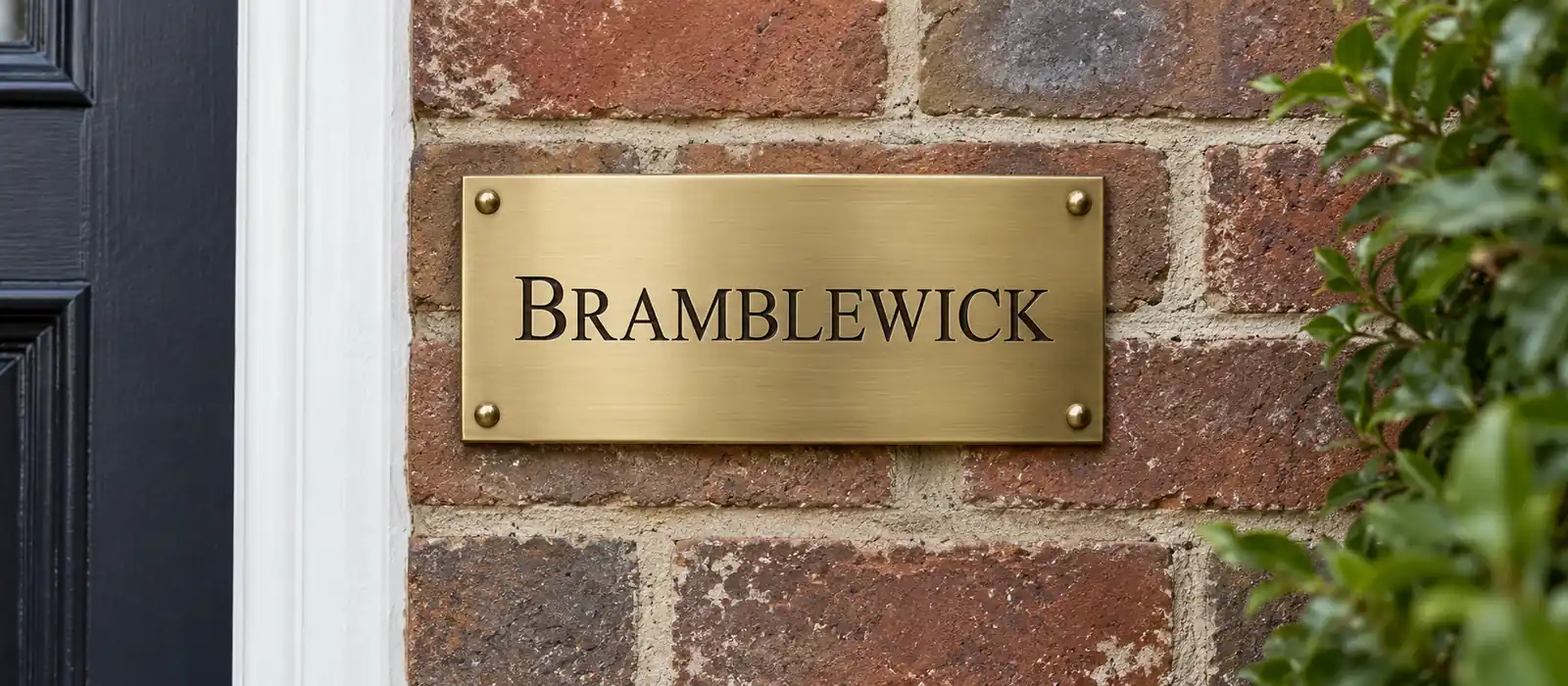
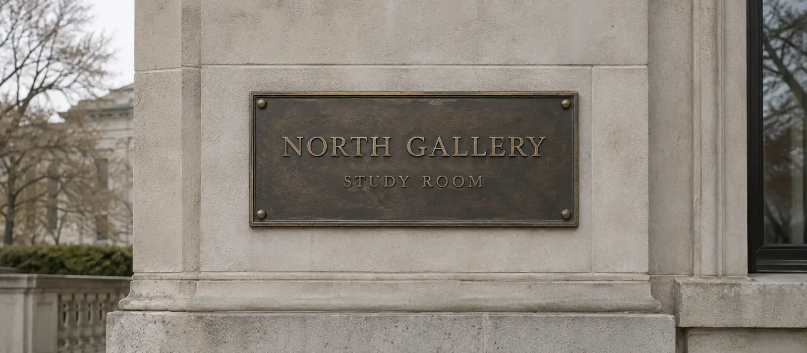
- Slate, brass and bronze — commemorative and heritage plaques, where appearance leads and the sign is not doing wayfinding work.
Fixing method matters more than it seems. Adhesive plates on a painted surface fail at the paint; mechanically fixed plates outlive the decoration behind them.
Practical points
- Numbering scheme first, plates second. A building renumbered after the signs are made is an expensive lesson.
- Consistent position on every door. The value of a system is that a user knows where to look without looking.
- Do not set room names in all capitals, however tidy it looks in the drawing.
- Standards are revised. The linked guidance and BS 8300 itself are the authority; this page is orientation.